Living Room
 Bedroom
 Exterior
 Neutral
 White
 Gray
 Green
 Blue
 Yellow
 Pink
 Black
 Red
 Brown
 Orange
Dew Drop SW 9641 Paint Colors by Sherwin Williams
Experience the Refreshing Calm of a Gentle Hue
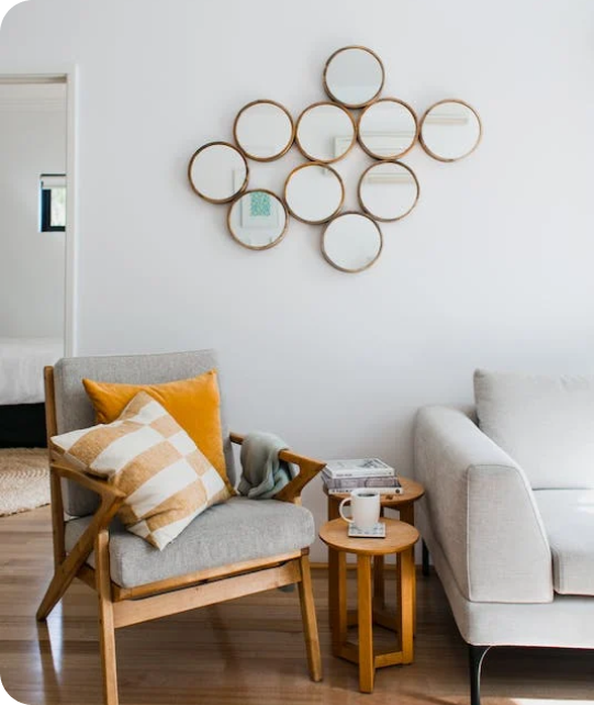
You might wonder what makes SW 9641 Dew Drop by Sherwin Williams stand out. It’s a unique paint color that can refresh any room with its subtle and gentle appeal. If you feel your room needs a touch of lightness or if you’re aiming to create a soothing atmosphere, this color can be your go-to. Its soft hue has a way of making rooms look clean and airy, making it ideal for bedrooms, living areas, and even bathrooms.
When you use SW 9641 Dew Drop, you’ll notice it provides a perfect backdrop for various decor styles and furniture choices, whether you prefer modern minimalism or cozy, rustic vibes. If you have a busier room, this color can help calm down the visual noise and bring a sense of order. Also, mixing and matching accessories become easier because Dew Drop pairs beautifully with many colors from bold to subtle.
While redecorating, you might appreciate how this paint adapts to different lighting conditions, showing off various charming tones throughout the day.
Lighting can make or break a room, and with Dew Drop, you are likely to be pleased with its performance across different scenarios. Give it a try and see how it can brighten up your living area!

via sherwin-williams.comn
What Color Is Dew Drop SW 9641 by Sherwin Williams?
Table of Contents
Dew Drop SW 9641 by Sherwin Williams is a refreshing and soft blue hue, reminiscent of early morning skies lightly brushed with clouds. This gentle color carries a hint of gray undertone, creating a soothing ambience in any room. Dew Drop offers an adaptable palette that works well with various interior styles, particularly those that aim for a peaceful and airy atmosphere.
Ideal for coastal, Scandinavian, or minimalist settings, Dew Drop brings a light and breezy feel to rooms. In coastal interiors, it mirrors the calm sea and sky, creating a relaxing retreat. For Scandinavian decor, it complements the style’s love for muted tones and natural light, enhancing the sense of openness. In minimalist interiors, Dew Drop acts as a subtle color pop that maintains simplicity while adding depth.
This color pairs beautifully with light woods such as pine or birch to maintain a natural and laid-back vibe. Textures like soft linens or cotton in whites or soft pastels complement Dew Drop, enhancing its peaceful quality without dominating the room. For accents, metallic finishes—particularly in silver or brushed nickel—add a subtle touch of elegance. This combination ensures a clean and inviting environment, perfect for rooms aiming to be a peaceful sanctuary.

via housekeepingbay.com
Is Dew Drop SW 9641 by Sherwin Williams Warm or Cool color?
Dew Drop SW 9641 by Sherwin Williams is a soft, gentle shade of green. A tint inspired by nature, it brings a calm, soothing mood to any room in the house. Ideal for areas where relaxation is key, such as bedrooms or bathrooms, the color has a freshness that echoes the early morning dew, subtly adding life without dominating the senses.
Its lightness pairs well with a variety of decor styles, from minimalist to shabby chic, allowing flexibility in its use. Because it is not a bold color, it allows other elements in the room, like furniture and artwork, to stand out. Yet, it provides enough color to ensure that rooms don’t look bland.
Aside from aesthetics, Dew Drop SW 9641 has a practical aspect; it reflects light well, making smaller rooms appear larger. This makes it a smart choice for small apartments or areas with limited natural light. It’s easy to apply to walls and complements natural wood tones and white trim effectively, creating a neat and coordinated look.
What is the Masstone of the Dew Drop SW 9641 by Sherwin Williams?
Dew Drop SW 9641 by Sherwin Williams has a masstone of Light Gray (#D5D5D5), which gives it a soft and subtle appearance. This quality makes it an excellent choice for creating a calm and soothing atmosphere in homes. The light gray color is highly adaptable and can work well in various rooms, from bedrooms and living rooms to kitchens and bathrooms.
Since it is a neutral shade, Dew Drop can easily blend with different decor styles and color schemes. It acts as a perfect backdrop, allowing furniture and artwork to stand out. Whether paired with bright colors or used with other neutral tones, it maintains a balanced look without dominating other elements in the room.
Light gray also has the advantage of making rooms appear larger and more open, which can be particularly beneficial in smaller or darker areas. By reflecting light, this color can help to brighten rooms that do not receive a lot of natural sunlight, contributing to a lighter and airier feel in any home.

via housekeepingbay.com
How Does Lighting Affect Dew Drop SW 9641 by Sherwin Williams?
Lighting significantly impacts how colors appear in different environments, making it essential to consider light sources when choosing a paint color, such as Dew Drop SW 9641 by Sherwin Williams. This shade is a soft, pale green which can vary in appearance depending on the lighting conditions.
In artificial light, Dew Drop SW 9641 may seem slightly warmer due to the yellow or warm white bulbs commonly used in homes. This can give the room a cozy and inviting feel, as the light enhances the green’s yellow undertones, making the color seem softer and more muted.
In natural light, this color responds dynamically. Its appearance changes subtly throughout the day as the intensity and angle of the natural light vary. Natural light tends to show the truest color, so Dew Drop SW 9641 will look crisp and more vivid under natural lighting than under most artificial sources.
Regarding the orientation of rooms:
- North-Faced Rooms: These rooms get less direct sunlight, which can make colors appear cooler. Dew Drop SW 9641 may look more subdued and slightly bluer in north-facing rooms.
- South-Faced Rooms: These rooms benefit from abundant natural light most of the day, which can make Dew Drop SW 9641 appear brighter and more vibrant. The warm light can enhance the cozy feel of this color.
- East-Faced Rooms: Morning light is cooler, so Dew Drop SW 9641 will appear fresher and brighter in the morning, shifting towards a softer tone as the day progresses when the natural light decreases.
- West-Faced Rooms: Evening light is warmer, so the color will look more vibrant and warmer in the afternoon and evening, adding to a pleasant ambiance as the day ends.
These variations highlight why it’s valuable to test paint colors in specific rooms at different times of the day to see how lighting affects the appearance before making a final decision.

via housekeepingbay.com
What is the LRV of Dew Drop SW 9641 by Sherwin Williams?
Higher LRV colors make rooms feel more open and brighter as they reflect more light, while lower LRV colors create a cozier, more enclosed feel by absorbing more light.
The LRV of Dew Drop SW 9641 by Sherwin Williams is 70.431, which means it is a fairly light color that reflects quite a bit of light. In rooms with less natural light, using a color with this LRV can make the area feel airier and more open.
Conversely, in very brightly lit rooms, it helps to maintain a light, refreshing feel without being too stark or glaring. This makes Dew Drop an adaptable choice, working well in various lighting conditions to create a pleasant and inviting environment.

via housekeepingbay.com
What are the Trim colors of Dew Drop SW 9641 by Sherwin Williams?
Trim colors are specific shades used to accentuate or define the borders around windows, doors, and baseboards, adding a distinct boundary and aesthetic contrast to wall colors. Using trim colors effectively, like SW 7037 – Balanced Beige or SW 7043 – Worldly Gray, when pairing with a main color such as Dew Drop SW 9641 by Sherwin Williams, can refine and subtly enhance the overall look of a room, making the primary hue stand out while also tying together the design elements cohesively.
Balanced Beige, SW 7037, offers a warm, neutral tone that adds a soft, inviting quality to interiors when used as a trim color, giving rooms a grounded appearance without dominating the principal shade.
Worldly Gray, SW 7043, on the other hand, is a subtle gray with a touch of elegance, providing a sleek, modern finish when applied as trim, pairing well with cooler colors and serving to subtly define areas in a chic manner without causing a jarring visual break.
You can see recommended paint colors below:

via housekeepingbay.com
Colors Similar to Dew Drop SW 9641 by Sherwin Williams
Similar colors are crucial in interior design because they create harmony and a seamless visual flow in a room. These shades enhance the overall aesthetic without creating stark contrasts, providing a soothing and cohesive look. For instance, colors like Dew Drop SW 9641 by Sherwin Williams and its similar hues create a peaceful palette that can make rooms appear larger and more inviting.
Mountain Air SW 6224 is a gentle gray with a touch of blue that evokes the feeling of a crisp, clear morning. Olympus White SW 6253 offers a slightly ethereal gray-white that glows softly in daylight, making it perfect for creating a peaceful backdrop. Silent Ripple SW 9682 is a muted gray with a subtle blue undertone, resembling the calm surface of a lake.
Quicksilver SW 6245 is a cool gray that reflects light beautifully, ideal for modern interiors. Topsail SW 6217 whispers relaxation with its airy blue, reminiscent of a light sea breeze. Hinting Blue SW 6519 is a pale, soothing blue with just a hint of depth, perfect for a peaceful bedroom. Icicle SW 6238 portrays a crisp, clean feeling, like a fresh snowfall, brightening any room.
Lullaby SW 9136 is a soft, muted blue with a calming effect, great for nurseries or quiet areas. Serenely SW 9632, a light gray with blue underpinnings, gives a peaceful, gentle vibe. Lastly, Mantra SW 9631 melds subtle gray with hints of blue, offering a soothing hue that’s flexible in various settings. These colors collectively foster an environment of peace and cohesion in any living area.
You can see recommended paint colors below:
- SW 6224 Mountain Air
- SW 6253 Olympus White
- SW 9682 Silent Ripple
- SW 6245 Quicksilver
- SW 6217 Topsail
- SW 6519 Hinting Blue
- SW 6238 Icicle
- SW 9136 Lullaby
- SW 9632 Serenely
- SW 9631 Mantra

via housekeepingbay.com
How to Use Dew Drop SW 9641 by Sherwin Williams In Your Home?
Dew Drop SW 9641 by Sherwin Williams is a gentle, soothing color that can help create a calm atmosphere in any home. This light bluish-green hue resembles the soft touch of morning dew, offering a fresh and clean look that’s perfect for living rooms, bedrooms, and bathrooms. Its subtle tone works well with both modern and traditional decor, providing a backdrop that allows furniture and art pieces to shine.
In a bedroom, Dew Drop can help set a peaceful mood, conducive to relaxation and rest. When used in a bathroom, it adds a spa-like feel, turning the room into a refreshing retreat. In the living room, pairing it with natural elements like wood and plants can enhance the sense of calm.
For those looking to refresh their kitchen, Dew Drop works beautifully on cabinets or as an accent wall, pairing well with white or grey tones. It’s an adaptable color that works easily with various styles and preferences, making it ideal for almost any room.
Dew Drop SW 9641 by Sherwin Williams vs Mountain Air SW 6224 by Sherwin Williams
Dew Drop SW 9641 and Mountain Air SW 6224 by Sherwin Williams are both soft and soothing colors, yet they offer distinct vibes for interior settings. Dew Drop is a pale, creamy white that feels fresh and clean. This shade can make small rooms appear larger and brighter, as it reflects light well. It’s perfect for creating a calm and peaceful environment.
Mountain Air, meanwhile, is a light, airy shade of blue with a hint of gray. This color is ideal for those looking to add a subtle touch of color to their room while maintaining a light and open feel. It can give a room a cool and refreshing atmosphere, reminiscent of a gentle breeze in a mountainous area.
Both colors work beautifully in interiors that aim for a minimalist and peaceful aesthetic. Dew Drop is generally more adaptable and can be paired effortlessly with a wide range of colors and decor, while Mountain Air provides a gentle hint of color to complement neutral tones.
You can see recommended paint color below:
- SW 6224 Mountain Air

via housekeepingbay.com
Dew Drop SW 9641 by Sherwin Williams vs Silent Ripple SW 9682 by Sherwin Williams
“Dew Drop SW 9641” and “Silent Ripple SW 9682” by Sherwin Williams are both soothing colors but have distinct tones. Dew Drop is a pale, soft green with a hint of freshness, suitable for creating a light and airy ambiance in a room. It reflects natural light beautifully, making rooms appear larger and more open. This color works well in bedrooms and bathrooms for a gentle, calming effect.
On the contrary, Silent Ripple is slightly deeper, presenting a subtle blend of blue and gray. This color suggests a peaceful, composed atmosphere, ideal for areas where calm and focus are desired, such as home offices or reading nooks. It pairs well with darker furniture or accents, providing a refined contrast.
Both colors promote a peaceful environment though they invoke different moods due to their unique undertones. Dew Drop offers a more vibrant, rejuvenating feel, while Silent Ripple leans towards a polished, muted elegance. Together, these colors could complement each other in a home, balancing energy and calmness.
You can see recommended paint color below:

via housekeepingbay.com
Dew Drop SW 9641 by Sherwin Williams vs Olympus White SW 6253 by Sherwin Williams
Dew Drop SW 9641 by Sherwin Williams is a soft, delicate color that gently reflects light, giving rooms a subtle warmth. This color feels airy and light, setting a peaceful tone perfect for areas where calm is key, like bedrooms or a quiet reading nook. It’s an adaptable shade that pairs well with both bright and muted accents.
Olympus White SW 6253, also by Sherwin Williams, is cooler and leans more towards a neutral gray than Dew Drop. It offers a clean and fresh look but with a touch of refinement due to its understated blue undertones. This color is ideal for modern interiors and works well in areas that require a crisp, peaceful backdrop without feeling too stark.
Comparatively, while both colors provide soothing atmospheres, Dew Drop affords a warmer feel and Olympus White presents a sleek, modern vibe. Each color creates distinctly different moods and can be matched with various decor styles to complement the intended room vibe.
You can see recommended paint color below:

via housekeepingbay.com6
Dew Drop SW 9641 by Sherwin Williams vs Mantra SW 9631 by Sherwin Williams
The color Dew Drop SW 9641 by Sherwin Williams is a light and airy tone that brings to mind the freshness of early morning. It appears soft and subtle, offering a backdrop that feels clean and relaxing. This color can make small rooms appear larger and more inviting. Dew Drop is ideal for creating a peaceful atmosphere in bedrooms or living areas.
In contrast, Mantra SW 9631 falls into a muted, neutral category with a slightly grayer undertone. This shade is tailored for those looking to achieve a contemporary look without veering too far into stark or cold territory. Mantra provides a refined neutral base, allowing for flexible decor options.
Both Dew Drop and Mantra have their unique charm and usability, with Dew Drop leaning toward a lighter refreshment and Mantra offering a chic, neutral canvas. The choice between them depends on the desired mood and function of the room you are decorating.
You can see recommended paint color below:

via housekeepingbay.com
Dew Drop SW 9641 by Sherwin Williams vs Quicksilver SW 6245 by Sherwin Williams
Dew Drop SW 9641 by Sherwin Williams is a gentle, light green shade that suggests freshness and calmness. It resembles the light tone of early morning dew, providing a soft and subtle feel to any room. This color pairs well with natural materials and is ideal for creating a soothing environment.
In contrast, Quicksilver SW 6245 by Sherwin Williams is a cool, muted gray that has a modern and clean appearance. This color fits well in rooms that aim for a sleek, contemporary look, and it easily complements bold and bright colors or acts as a standalone neutral in a minimalist design.
While Dew Drop brings a natural, peaceful vibe that’s perfect for relaxed areas like bedrooms and bathrooms, Quicksilver offers a flexible backdrop suitable for more dynamic areas such as living rooms and home offices. Both colors support different styles and themes, enhancing a room’s aesthetic based on the intended atmosphere and function.
You can see recommended paint color below:

via housekeepingbay.com
Dew Drop SW 9641 by Sherwin Williams vs Hinting Blue SW 6519 by Sherwin Williams
Dew Drop SW 9641 and Hinting Blue SW 6519 from Sherwin Williams are two distinct paint colors. Dew Drop is a very pale, almost ethereal green with a hint of gray. This subtle and soft color works well in rooms that aim for a light, airy feel, providing a gentle backdrop that doesn’t overpower room elements.
In contrast, Hinting Blue SW 6519 is a light blue with gray undertones, offering a calm and soothing presence. This color is ideal for creating a peaceful environment, perfect for areas where relaxation is key, such as bedrooms and bathrooms.
Both colors are light and muted, but while Dew Drop leans towards a greenish tint, Hinting Blue offers a cooler tone due to its blue base. Each color supports a peaceful and refreshing atmosphere, yet the choice between them depends on the desired warmth or coolness in the room’s color scheme.
You can see recommended paint color below:
- SW 6519 Hinting Blue

via housekeepingbay.com
Dew Drop SW 9641 by Sherwin Williams vs Topsail SW 6217 by Sherwin Williams
Dew Drop SW 9641 by Sherwin Williams is a very light, soothing green with a fresh and airy quality that gives rooms a gentle, calming vibe. It’s almost neutral, making it highly adaptable for use in various rooms, including bedrooms and living areas, where a touch of peacefulness is desired.
In contrast, Topsail SW 6217, also by Sherwin Williams, leans more towards a soft, muted blue with subtle green undertones. This color creates a peaceful, relaxing ambiance but with a slightly cooler tone compared to Dew Drop. Topsail is particularly well-suited for bathrooms and bedrooms owing to its marine-like feel that is soft and restful.
Both colors share a lightness and softness that can expand small rooms or make larger rooms feel more intimate and peaceful. While Dew Drop brings a natural, spring-like feel, Topsail offers a sense of coastal calm, making them both excellent choices for creating a relaxed and airy environment in your home.
You can see recommended paint color below:

via housekeepingbay.com
Dew Drop SW 9641 by Sherwin Williams vs Serenely SW 9632 by Sherwin Williams
Dew Drop SW 9641 by Sherwin Williams is a light, airy blue with a touch of gray, giving it a cool, calm feel that is perfect for creating a soothing atmosphere in any room. It is an ideal color for areas intended to be peaceful retreats, such as bedrooms or bathrooms, where the gentle hue helps foster relaxation.
Serenely SW 9632, also by Sherwin Williams, is a subtle green with gray undertones. This color has a natural, soft look that can make rooms feel more grounded and comforting. It’s great for areas where a touch of nature is desired without dominating the room with brighter greens.
Both colors are muted and subtle, making them adaptable for various decorating styles. Dew Drop leans more towards a refreshing, peaceful vibe due to its blue tones, while Serenely offers a more earthy, comforting feel, thanks to its greenish cast. Both are excellent choices for those seeking to create a peaceful, restful environment.
You can see recommended paint color below:

via housekeepingbay.com
Dew Drop SW 9641 by Sherwin Williams vs Icicle SW 6238 by Sherwin Williams
Dew Drop SW 9641 by Sherwin Williams is a soft, light green hue with a subtle freshness that resembles the gentle touch of early morning dew. It creates a soothing and calm atmosphere, ideal for rooms where you seek peace and a connection to nature. This color is adaptable, working well in both bright, sunlit rooms and dimmer, cozier areas due to its muted yet lively character.
In contrast, Icicle SW 6238 by Sherwin Williams leans more towards a cool, light gray with blue undertones, giving a clean and crisp look. This color is great for creating a modern and peaceful environment, suggesting a sense of cleanliness and simplicity. It suits areas meant to feel more open and airy, like bathrooms and minimalist living rooms.
While both colors promote a peaceful environment, Dew Drop introduces a touch of nature and warmth, whereas Icicle provides a minimalist, cooler vibe. Each brings its unique flair to interiors, enhancing different elements of décor and style preferences.
You can see recommended paint color below:
- SW 6238 Icicle

via housekeepingbay.com
Dew Drop SW 9641 by Sherwin Williams vs Lullaby SW 9136 by Sherwin Williams
Dew Drop SW 9641 and Lullaby SW 9136 are both colors by Sherwin Williams, but they offer different vibes for room settings. Dew Drop is a light, soft green with a refreshing and airy feel that can make rooms seem larger and more open. It’s great for creating a calm and soothing environment.
Lullaby, on the contrary, is a gentle blue with a slightly muted tone, giving it a cozy and peaceful quality that’s excellent for bedrooms or areas where relaxation is key.
While Dew Drop brings a hint of nature and rejuvenation, ideal for living rooms or bathrooms, Lullaby focuses more on providing a peaceful retreat, perfect for unwinding. Both colors work well in rooms that aim for a subtle and comforting atmosphere, but your choice might depend on the room’s purpose and the mood you want to induce. Dew Drop’s adaptability in various lighting conditions also offers a vibrant yet understated backdrop, whereas Lullaby maintains a consistent, calming presence.
You can see recommended paint color below:
- SW 9136 Lullaby

via housekeepingbay.com
It’s evident that Dew Drop’s soft and soothing hue makes it an adaptable choice, suitable for creating a calm and inviting setting in homes or offices. What stands out the most is how well it pairs with both bold and neutral shades, allowing for varied design flexibility without dominating the senses.
I appreciate the detailed examples provided of different settings where Dew Drop can be effectively applied. These scenarios help to visualize the potential changes without having to commit first. This shade seems ideal for anyone looking to refresh their interiors with a touch of gentleness, enhancing the aesthetics without demanding major changes to existing decor.
Overall, the article solidifies my view that SW 9641 Dew Drop is not just a trend but an enduring choice that can support various design preferences and last through changing styles over the years. Whether you’re updating a single room or considering a more extensive renovation, this color offers a foundation that promises both beauty and longevity. I’m now more confident and clear about how I can use Dew Drop in my own projects to achieve a refined and pleasant atmosphere.

via housekeepingbay.com