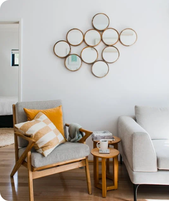
Living Room
 Bedroom
 Exterior
 Neutral
 White
 Gray
 Green
 Blue
 Yellow
 Pink
 Black
 Red
 Brown
 Orange
Blue Trends For the Whole House 2027
Fresh Blue Shades for a Stylish Home
Blue is one of my favorite colors for creating a home that feels fresh, stylish, and comfortable. For 2027, I see blue moving beyond simple accent walls and becoming a strong choice for bathrooms, living rooms, kitchens, cabinets, exteriors, and walls throughout the home. I like working with blue because there are so many different moods within one color family. Light blue can make a room feel brighter and more open, while medium blue adds character without becoming too heavy.
Darker blues bring depth and contrast, especially when I pair them with warm whites, natural wood, marble, stone, or brass details. Blue-gray shades are also useful when I want color that works easily with neutral furniture and finishes.
In this guide, I share the blue paint colors I would consider for different areas of the home, including options from Sherwin-Williams and Benjamin Moore. My goal is to help you compare light, medium, and dark blues and choose shades that fit your lighting, materials, and personal style.

via housekeepingbay.com
Blue Color Palette for the Bathroom — Designers’ Picks
Table of Contents
For bathrooms, I like blue because it can make the room feel fresh, polished, and visually lighter. Blue works especially well with white tile, natural stone, light wood, marble, and metal fixtures, giving me plenty of ways to build a luxury bathroom design.
Blue bathroom walls work naturally with white or cream tiles, marble countertops, light wood vanities, brushed nickel, polished chrome, warm brass, and soft neutral textiles. Lighter and medium blue shades can keep a bathroom bright, while blue-gray tones add more definition to vanities, walls, and decorative details.
- Sea Salt SW 6204
- Tradewind SW 6218
- Rainwashed SW 6211
- Boothbay Gray HC-165
- Smoke 2122-40
- Van Courtland Blue HC-145
I like using these shades as the base of a bathroom palette and then choosing tile, cabinetry, and hardware around them. Sea Salt works well when I want a lighter and softer result, while Van Courtland Blue gives me more depth and stronger contrast. Boothbay Gray and Smoke are useful when I want blue mixed with enough gray to create a more polished look. For this palette, I would pair these blue shades with clean whites, marble, natural wood, brushed nickel, polished chrome, or warm brass to give the bathroom a fresh and finished look.

via housekeepingbay.com
Light Blue Color Palette for the Bathroom
Light blue is one of my favorite choices when I want a bathroom to look bright and fresh without using plain white on every wall. These shades bring gentle color into the room and work especially well in bathrooms with white tile, marble, pale stone, and light cabinetry.
Light blue bathroom walls pair naturally with crisp white trim, marble surfaces, white or light wood vanities, polished chrome, brushed nickel, and simple neutral textiles. I often use lighter blues in smaller bathrooms because they add color without making the room look visually heavy.
- Upward SW 6239
- Sleepy Blue SW 6225
- North Star SW 6246
- Misty SW 6232
- Breath of Fresh Air 806
- Palladian Blue HC-144
I like Upward when I want a fresh blue that is clearly visible, while Misty and North Star give me more gray in the final look. Sleepy Blue works nicely with white cabinetry, and Palladian Blue adds a gentle blue-green note that looks beautiful beside marble and natural wood. For a light blue bathroom, I would keep the main finishes bright and add warmth through pale wood, brass details, woven accessories, or creamy white textiles.

via housekeepingbay.com
Darker Blue Color Palette for the Bathroom
Darker blue shades give me a very different bathroom design because they bring stronger contrast and make cabinetry, tile, mirrors, and metal details stand out. I often use these colors when I want the bathroom to feel richer and more defined.
Dark blue works especially well with white marble, crisp white tile, warm wood vanities, brass hardware, polished nickel, and lighter countertops. These shades can cover an entire wall, but I also like using them on vanity cabinets, paneled walls, or one main feature wall.
- Naval SW 6244
- Sea Serpent SW 7615
- Smoky Blue SW 7604
- Waterloo SW 9141
- Hale Navy HC-154
- Newburyport Blue HC-155
I use Naval and Hale Navy when I want a deep navy foundation, while Smoky Blue and Waterloo give me a softer blue-gray result. Sea Serpent adds rich depth, and Newburyport Blue works beautifully when I want a classic dark blue that still reads clearly against white finishes. For darker blue bathrooms, I would balance the deeper walls or cabinetry with lighter tile, countertops, mirrors, and warm metal details so the final design stays bright and polished.

Blue Color Palette in the Living Room — 2027 Trends
For 2027 living rooms, I like blue because it gives the interior more character while still working easily with wood, stone, neutral upholstery, and metal details. Medium blue and blue-gray shades are especially useful when I want the walls to add color without taking attention away from furniture and decor.
Blue living room walls work naturally with warm white trim, beige or cream upholstery, natural wood furniture, stone fireplaces, brass details, and soft neutral textiles. I use medium blues when I want more definition than a pale wall color can provide, while still keeping the room comfortable and easy to decorate.
- Upward SW 6239
- Stardew SW 9138
- Smoky Blue SW 7604
- Waterloo SW 9141
- Van Courtland Blue HC-145
- Boothbay Gray HC-165
I like Upward when I want a brighter blue foundation, while Stardew gives me a softer blue-gray result. Smoky Blue and Waterloo bring more depth to larger living rooms, and Van Courtland Blue works beautifully with classic furniture. Boothbay Gray is a good choice when I want the blue to feel more muted beside warm neutrals. For 2027, I would pair these blue shades with creamy whites, medium or dark wood, beige upholstery, natural stone, and warm metal details for a balanced living room palette.

via housekeepingbay.com
Light Blue Color Palette in the Living Room
Light blue can make a living room feel brighter while adding more personality than a basic white or light gray. I often choose these shades for rooms with plenty of natural light, pale furniture, or warm wood details.
Light blue walls pair beautifully with cream sofas, white trim, oak furniture, natural linen, pale stone, brushed nickel, and warm brass accents. These colors are especially useful when I want the walls to provide a gentle background for furniture, artwork, and decorative pieces.
- Misty SW 6232
- Sleepy Blue SW 6225
- North Star SW 6246
- Tradewind SW 6218
- Breath of Fresh Air 806
- Palladian Blue HC-144
I like Misty and North Star when I need more gray in the palette, while Breath of Fresh Air gives me a clearer blue look. Sleepy Blue works nicely with warm neutral furniture, and Tradewind adds a fresh blue-gray note. Palladian Blue is useful when I want a hint of green mixed into the blue. For a light blue living room, I would add warm wood, creamy fabrics, natural textures, and a few darker accents to give the interior enough contrast.

via housekeepingbay.com
Darker Blue Color Palette in the Living Room
Dark blue can give a living room strong definition and make lighter furniture, artwork, and architectural details stand out. I like using these shades in larger rooms, on feature walls, or in living rooms where I want a richer background.
Dark blue living room walls work especially well with cream upholstery, white trim, walnut furniture, natural stone, warm brass, and lighter rugs. I often balance these deeper shades with lighter furniture and warm materials so the room does not become visually heavy.
- Naval SW 6244
- Sea Serpent SW 7615
- Waterloo SW 9141
- Indigo Batik SW 7602
- Hale Navy HC-154
- Newburyport Blue HC-155
I use Naval and Hale Navy when I want a deep navy foundation, while Waterloo gives me more gray and a slightly softer finish. Indigo Batik brings a clearer blue character, and Sea Serpent works well when I need a dark shade with extra depth. Newburyport Blue is a strong choice for traditional living rooms with white molding and warm wood furniture. For darker blue living rooms, I would balance the walls with cream, warm white, natural wood, lighter flooring, and warm metals to keep the overall palette inviting and well defined.

via housekeepingbay.com
Blue Color Palette for the Kitchen and Kitchen Cabinets — Designers’ Opinion
Blue kitchen cabinets are one of my favorite ways to bring color into a kitchen without depending on bright walls or decorative accessories. Blue-gray and deeper blue shades work especially well with stone countertops, tile backsplashes, wood flooring, and metal hardware.
Blue kitchen cabinets pair naturally with white or cream countertops, marble, warm wood, brass hardware, polished nickel, and simple neutral backsplashes. I use medium blues for a softer cabinet look and deeper shades when I want the cabinetry to become a stronger part of the kitchen design.
- Smoky Blue SW 7604
- Stardew SW 9138
- Waterloo SW 9141
- Naval SW 6244
- Van Deusen Blue HC-156
- Hale Navy HC-154
I like Stardew for lighter cabinetry, while Smoky Blue and Waterloo give me more depth without becoming extremely dark. Naval and Hale Navy create stronger contrast against white countertops, and Van Deusen Blue gives cabinets a rich blue finish that works beautifully with warm metals. For blue kitchen cabinets, I would pair these shades with light countertops, warm wood, cream or white backsplashes, and brass or polished nickel hardware for a clean and finished result.

via housekeepingbay.com
Light Blue Color Palette for the Kitchen and Kitchen Cabinets
Light blue cabinetry can give a kitchen fresh color while keeping the overall design bright. I especially like these shades for smaller kitchens, kitchen islands, lower cabinets, and rooms with light countertops.
Light blue cabinets work beautifully with white quartz, marble, warm white backsplashes, pale oak, brushed nickel, and warm brass hardware. These colors give me enough blue to make the cabinetry noticeable without creating a heavy visual block.
- Upward SW 6239
- Misty SW 6232
- Sleepy Blue SW 6225
- Tradewind SW 6218
- Palladian Blue HC-144
- Breath of Fresh Air 806
I like Upward and Breath of Fresh Air when I want the blue to be more visible, while Misty and Sleepy Blue give me a softer gray-blue finish. Tradewind works well with white countertops and stainless steel, while Palladian Blue adds a gentle blue-green note beside natural wood. For light blue kitchen cabinetry, I would use white or cream counters, warm wood flooring, simple backsplashes, and metal hardware that adds just enough contrast.

via housekeepingbay.com
Darker Blue Color Palette for the Kitchen and Kitchen Cabinets
Dark blue cabinets can give a kitchen a rich, defined look and create strong contrast against lighter countertops and backsplashes. I often use these shades on lower cabinets or kitchen islands when I want depth without covering every surface in a dark color.
Dark blue cabinetry works especially well with white marble, quartz, warm wood flooring, brass hardware, polished nickel, and creamy white walls. The deeper color can make cabinet details more noticeable, especially when paired with lighter counters and good lighting.
- Naval SW 6244
- Sea Serpent SW 7615
- Indigo Batik SW 7602
- Cyberspace SW 7076
- Hale Navy HC-154
- Van Deusen Blue HC-156
I like Naval and Hale Navy for classic navy cabinetry, while Indigo Batik gives me a stronger blue presence. Sea Serpent adds more depth, and Cyberspace is useful when I want the cabinetry to read as an extremely dark blue-gray. Van Deusen Blue works beautifully when I want rich blue cabinets that still show their color clearly. For darker blue kitchen cabinets, I would keep countertops and backsplashes lighter and add warm wood or metal details to create clear contrast throughout the kitchen.

via housekeepingbay.com
Blue Color Palette for the Exterior Use — 2027 Trends
For 2027 exteriors, I like blue because it gives a home a clear identity while working naturally with stone, brick, wood, and light trim. Medium and deeper blue shades can make siding and architectural details stand out without depending on very bright color.
Blue exterior paint works naturally with warm white trim, natural stone, wood doors, brick, black accents, and warm metal details. I often choose blue-gray shades for larger exterior surfaces because the gray helps the color work well under changing daylight.
- Smoky Blue SW 7604
- Waterloo SW 9141
- Naval SW 6244
- Sea Serpent SW 7615
- Hale Navy HC-154
- Van Deusen Blue HC-156
I like Smoky Blue and Waterloo when I want a medium blue with a muted finish, while Naval gives the exterior much stronger contrast. Sea Serpent works well on homes surrounded by natural greenery, and Hale Navy creates a rich background for light trim. Van Deusen Blue is useful when I want a classic blue that stays clearly visible outdoors. For 2027 exteriors, I would pair these blue shades with warm white trim, natural stone, medium wood tones, black accents, and simple metal details for a polished result.

via housekeepingbay.com
Light Blue Color Palette for the Exterior Use
Light blue can make an exterior look fresh and welcoming while keeping the overall color scheme bright. I like these shades for siding, shutters, porch details, and homes where darker exterior paint would feel too heavy.
Light blue exterior paint pairs beautifully with warm white trim, pale stone, natural wood doors, gray roofing, brick, and simple black accents. I usually test light blues outside before making a final choice because direct sunlight can make the color look much lighter than it does indoors.
- Upward SW 6239
- Misty SW 6232
- Tradewind SW 6218
- Stardew SW 9138
- Palladian Blue HC-144
- Boothbay Gray HC-165
I like Upward when I want a clearer light blue, while Misty gives me more gray and a softer exterior finish. Tradewind works beautifully with white trim, and Stardew adds slightly more depth. Palladian Blue brings a blue-green character, while Boothbay Gray is useful when I want the exterior to lean more toward blue-gray. For light blue exteriors, I would add warm white trim, natural wood, stone, and a few darker accents so the house has enough definition from the street.

via housekeepingbay.com
Darker Blue Color Palette for the Exterior Use
Dark blue exterior paint can give a home strong definition and make trim, windows, doors, and architectural features much more noticeable. I often choose these shades when I want the exterior to have a richer look with clear contrast.
Dark blue siding works especially well with warm white trim, natural stone, wood garage doors, black windows, brick, and brass or bronze details. These deeper shades can work across the full exterior, but I also use them on shutters, front doors, garages, and other architectural features.
- Naval SW 6244
- Sea Serpent SW 7615
- Indigo Batik SW 7602
- Cyberspace SW 7076
- Hale Navy HC-154
- Newburyport Blue HC-155
I use Naval and Hale Navy when I want a classic dark navy foundation, while Indigo Batik shows more noticeable blue. Sea Serpent gives me a deep blue with a muted character, and Cyberspace can look nearly charcoal under certain lighting. Newburyport Blue works especially well with light trim and traditional exterior details.
For darker blue exteriors, I would balance the main color with lighter trim, natural materials, and warm wood so the house looks defined without becoming visually heavy.

via housekeepingbay.com
Blue Color Palette for the Walls — Designers’ Picks
Blue walls give me an easy way to bring color into an interior while still leaving many choices for furniture, flooring, and decor. I especially like medium blue and blue-gray shades because they can work in bedrooms, living rooms, dining rooms, bathrooms, and home offices.
Blue walls work naturally with creamy whites, beige upholstery, natural wood, stone, brass, brushed nickel, and soft neutral fabrics. I choose the exact depth based on the amount of daylight in the room and how much contrast I want between the walls and furniture.
- Stardew SW 9138
- Smoky Blue SW 7604
- Upward SW 6239
- Waterloo SW 9141
- Van Courtland Blue HC-145
- Boothbay Gray HC-165
I like Stardew and Upward when I want a lighter wall treatment, while Smoky Blue and Waterloo give me more definition. Van Courtland Blue works beautifully in rooms with classic details, and Boothbay Gray is useful when I need more gray mixed into the blue. Each shade can look different as daylight changes, so I always test a sample on more than one wall.
For blue walls, I would combine these shades with warm whites, natural wood, cream or beige fabrics, and carefully chosen darker accents for a balanced interior.

via housekeepingbay.com
Light Blue Color Palette for the Walls
Light blue walls can brighten a room while giving it more personality than plain white or pale gray. I like using these colors when I want a gentle background that still has enough color to be noticed.
Light blue walls pair naturally with warm white trim, cream furniture, light oak, natural fabrics, pale stone, and brushed or warm metal details. These shades work especially well in rooms with good natural light, but they can also help smaller rooms feel visually lighter.
- Misty SW 6232
- Sleepy Blue SW 6225
- North Star SW 6246
- Tradewind SW 6218
- Palladian Blue HC-144
- Breath of Fresh Air 806
I like Misty and North Star when I want a cooler blue-gray background, while Sleepy Blue brings a little more softness. Tradewind works well with white and pale wood, and Palladian Blue introduces a gentle blue-green note. Breath of Fresh Air gives me a clearer blue when I want the wall color to be more noticeable.
For light blue walls, I would use warm white trim, natural wood, cream fabrics, and a few deeper accents to give the room enough contrast and visual interest.

via housekeepingbay.com
Darker Blue Color Palette for the Walls
Dark blue walls can make a room feel richer and give furniture, artwork, molding, and lighter textiles a strong background. I like using these colors when I want the walls to become an important part of the interior rather than simply supporting the furniture.
Dark blue walls work beautifully with cream upholstery, warm white trim, walnut or oak furniture, natural stone, brass, and lighter flooring.
I often use deeper blues in rooms with good lighting or on selected walls where I want stronger visual definition.
- Naval SW 6244
- Sea Serpent SW 7615
- Smoky Blue SW 7604
- Indigo Batik SW 7602
- Hale Navy HC-154
- Van Deusen Blue HC-156
I like Naval and Hale Navy when I need a deep navy background, while Indigo Batik gives me a clearer blue finish. Sea Serpent creates a darker muted look, and Smoky Blue is easier to use when I want depth without going extremely dark. Van Deusen Blue works especially well with white molding, warm wood, and traditional interior details.
For darker blue walls, I would balance the deeper color with lighter furniture, warm white trim, natural wood, and warm metal accents so the finished room feels rich and well balanced.

via housekeepingbay.com