Living Room
 Bedroom
 Exterior
 Neutral
 White
 Gray
 Green
 Blue
 Yellow
 Pink
 Black
 Red
 Brown
 Orange
25 Top Paint Colors That Go With Yellow for a Bright Interior
Cheerful Shades for Warmth and Style
Yellow has a special way of making a room feel cheerful, warm, and full of life. As an interior designer and staging expert, I often use it when a home needs more energy without losing a welcoming feeling.
I have learned that the colors placed beside yellow matter just as much as the yellow itself. White can make it look fresh, beige can soften it, green can give it an earthy character, and navy can add strong contrast.The right pairing also depends on natural light, furniture, flooring, and the mood I want to create. A sunny kitchen may need a different partner than a bedroom with limited daylight.
In this guide, I am sharing the combinations I would consider first when working with yellow.
These choices include light neutrals, warm earth tones, greens, blues, grays, and deeper accents that help yellow look balanced and intentional.

via livingetc.com
Why I Always Trust Sherwin-Williams and Benjamin Moore for the Best Colors to Pair With Yellow
Table of Contents
When I work with yellow, I want supporting colors that have enough depth and character to keep the finished room from looking too sharp or too busy. Sherwin-Williams and Benjamin Moore give me many options for building combinations that feel polished and comfortable.
I especially like having access to warm whites, creamy neutrals, muted greens, deep blues, and charcoal shades. Each group can change the personality of yellow in a different way.A warm white can make yellow feel light and friendly, while navy can give it a more dramatic and tailored look. Beige and greige are useful when I want the room to feel softer and easier on the eyes.
I also consider how these colors react to daylight and artificial lighting. This is important because yellow can look much stronger in bright afternoon sun than it does in a shaded room. For staging, I usually want a combination that photographs well and feels welcoming when buyers walk through the door. These two brands give me plenty of choices for creating that type of balanced result.
How I Choose the Perfect Colors to Pair With Yellow for Any Interior
I start by looking at the type of yellow already in the room or the yellow I plan to use. A buttery yellow needs different partners than a bright lemon or deep golden shade.
Next, I study the room’s light. Northern light can make some yellows feel cooler, while strong southern light can make warm yellow look richer and more intense.I also check permanent finishes such as floors, countertops, tile, cabinets, and large furniture. I want the wall colors to connect with those elements instead of fighting against them.
For a soft look, I usually turn to warm white, cream, beige, greige, or muted green. For stronger contrast, I like navy, charcoal, dark brown, or black. Most importantly, I test samples before making the final decision. I look at them in the morning, afternoon, and evening because a pairing that looks beautiful at noon may feel very different after sunset.

via livingetc.com
18 Top Paint Colors That Go With Yellow From Sherwin-Williams
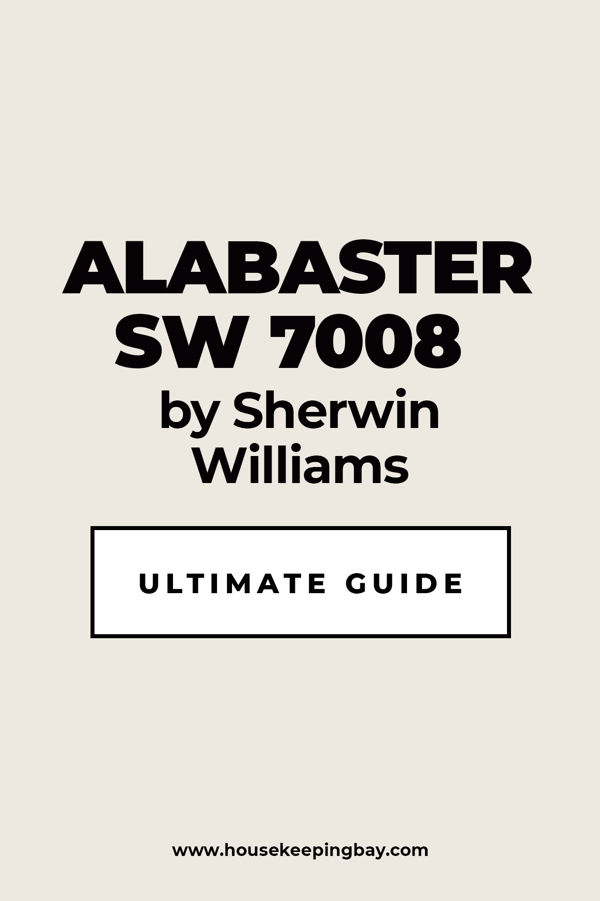
Alabaster SW 7008
Alabaster SW 7008 gives yellow a warm, clean background without making the room feel cold. I like this pairing when I want yellow to remain cheerful but not become too strong.
Its creamy character works beautifully beside buttery, golden, and muted yellow tones. Natural light brings out its warmth and helps the whole room feel welcoming.I often use it on walls when yellow appears on cabinets, furniture, textiles, or decor. It is also a smart trim choice when I want less contrast than a crisp white would create.
Wood floors fit naturally into this palette. Linen, rattan, stone, and woven fabrics also make the combination feel comfortable.For staging, I like how this shade keeps the background simple while allowing yellow accents to catch the eye. It can also help a yellow room feel brighter without adding another strong color.
The pairing works especially well in interiors with farmhouse, cottage, transitional, or warm modern details. I would keep the rest of the palette simple so the yellow remains the happy focal point.
Best used in: living rooms, kitchens, hallways, bedrooms, dining rooms, and farmhouse exteriors
Pairs well with: Friendly Yellow SW 6680, Butter Up SW 6681, Natural Linen SW 9109, Iron Ore SW 7069, warm wood tones
The key rule for this pairing is to use it where you want yellow to feel warm, friendly, and easy to live with throughout the day.
👉 Read the full guide for this color HERE 👈
Housekeepingbay.com
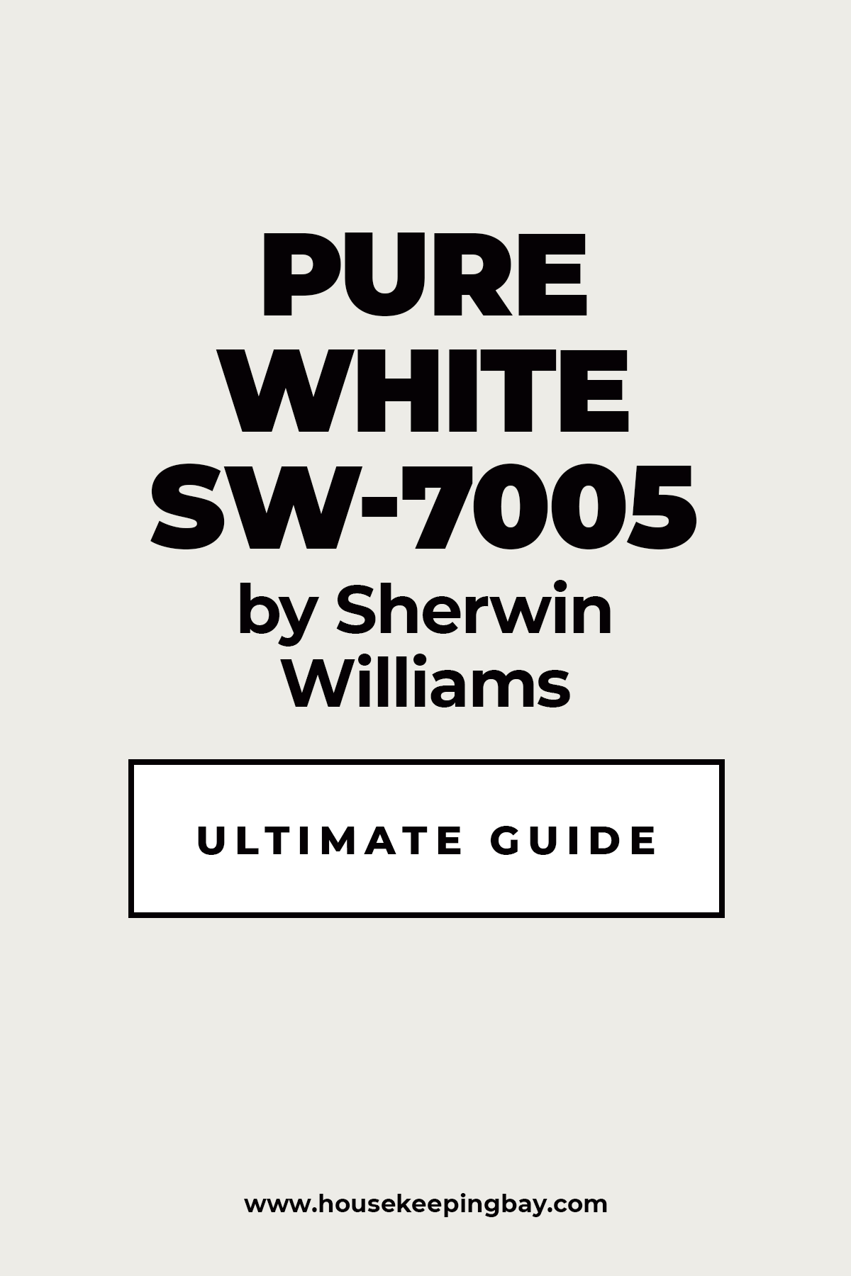
Pure White SW 7005
Pure White SW 7005 gives yellow a cleaner and brighter partner. I use this combination when I want the yellow to look fresh rather than heavy.
It works especially well with clear lemon, sunny, and medium yellow shades. The contrast is noticeable, but it does not have to feel harsh when natural materials are included.I like using it on trim, ceilings, cabinets, or nearby walls. Yellow can then become the feature color without covering every surface.
This pairing is useful in kitchens because it creates a bright and energetic feeling. It also works nicely in breakfast areas and children’s rooms.
Light oak, pale stone, and simple white textiles support the combination well. I may add a small amount of gray, blue, or black when the room needs more definition. For staging, this is one of the easiest ways to make yellow feel intentional and fresh. The result photographs well because the white gives the eye a clean resting point.
Best used in: kitchens, breakfast rooms, bathrooms, children’s rooms, entryways, and trim
Pairs well with: Lemon Twist SW 6909, Glad Yellow SW 6694, Naval SW 6244, Repose Gray SW 7015, light wood tones
The key rule for this pairing is to let the white provide breathing room when the yellow is bright or energetic.
👉 Read the full guide for this color HERE 👈
Housekeepingbay.com
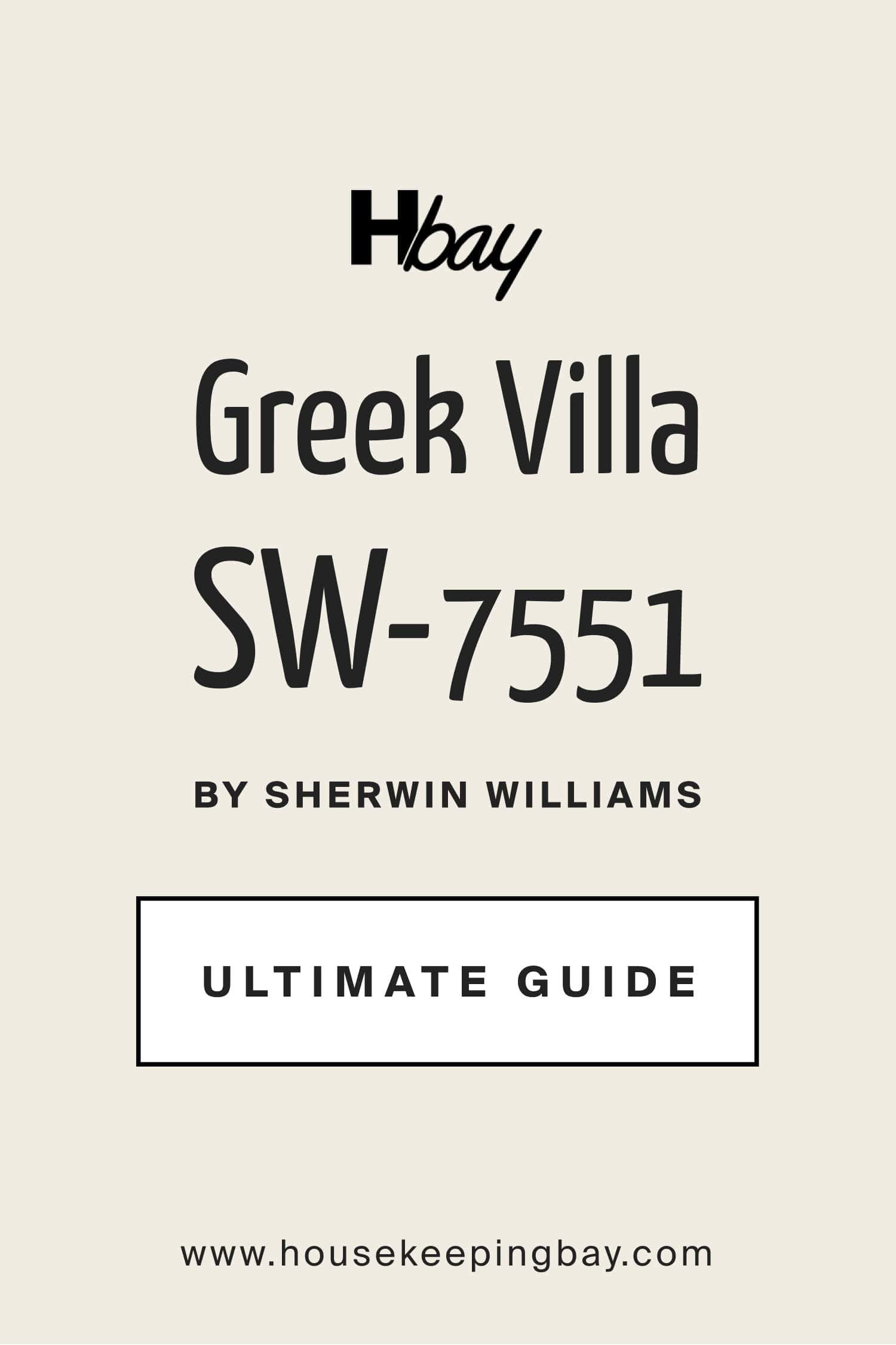
Greek Villa SW 7551
Greek Villa SW 7551 brings a creamy warmth that sits naturally beside yellow. I like it when I want a sunny palette that still feels soft and comfortable.
The shade works particularly well with golden, buttery, and wheat-like yellows. It keeps these tones from looking too sharp.I often use it for walls with yellow decor or for trim around a warm yellow wall. The combination has an easy, lived-in character. Natural wood furniture looks especially attractive with this pairing. Aged brass, woven baskets, cream fabrics, and stone can add more warmth.
In a kitchen, I could use the creamy neutral on cabinets and bring yellow into a breakfast nook or decorative details. In a bedroom, yellow bedding can provide enough color against the warm background. I also like this combination for homes that need warmth without too many competing shades. Keeping the materials natural makes the result feel connected.
Best used in: kitchens, bedrooms, dining rooms, living rooms, entryways, and cottage interiors
Pairs well with: Butter Up SW 6681, Friendly Yellow SW 6680, Natural Tan SW 7567, Rosemary SW 6187, medium wood tones
The key rule for this pairing is to keep the surrounding palette warm so the creamy base and yellow accents feel connected.
👉 Read the full guide for this color HERE 👈
housekeepingbay.com
Creamy SW 7012
Creamy SW 7012 is one of my favorite choices when yellow needs a gentle partner. Its warm character supports yellow without competing for attention.
I like it beside butter, honey, wheat, and muted golden shades. Together, these colors can make a room feel cozy and friendly.The combination works beautifully with warm wood flooring and traditional furniture. It can also fit cottage and farmhouse interiors with very little effort. I often use this shade on walls while bringing yellow into curtains, upholstery, artwork, or painted furniture. This keeps the main background easy to live with.
Warm lighting is especially flattering here. Lamps with soft bulbs can bring out the creamy character in the evening. For contrast, I may add dark bronze, deep green, or charcoal in small amounts. Those darker notes prevent the palette from becoming too pale.
Best used in: bedrooms, living rooms, dining rooms, kitchens, hallways, and cottage interiors
Pairs well with: Butter Up SW 6681, Bee SW 6683, Urbane Bronze SW 7048, Rosemary SW 6187, warm oak
The key rule for this pairing is to use warm materials and lighting so the yellow and creamy background feel rich rather than washed out.
👉 Read the full guide for this color HERE 👈

Accessible Beige SW 7036
Accessible Beige SW 7036 helps bring yellow down to earth. I use it when a yellow feature feels too energetic and needs a warmer neutral nearby.
The beige-gray character works well with mustard, golden, honey, and muted yellow tones. It gives the palette more maturity without removing its cheerful quality.I like this combination in living rooms where yellow may appear on chairs, pillows, artwork, or curtains. The neutral walls give those pieces enough room to stand out. Wood furniture is an easy match here. Leather, linen, stone, and woven materials can make the room feel even more grounded.
In staging, I find this type of palette useful because it feels warm without asking buyers to love a fully yellow room. Yellow becomes an accent rather than the entire story. Dark brown or charcoal details can add definition. Creamy white trim can finish the look without creating a sharp break.
Best used in: living rooms, family rooms, bedrooms, dining rooms, entryways, and open-plan interiors
Pairs well with: Butter Up SW 6681, Friendly Yellow SW 6680, Creamy SW 7012, Urbane Bronze SW 7048, walnut tones
The key rule for this pairing is to use the beige as the larger background and let yellow provide controlled moments of warmth.
👉 Read the full guide for this color HERE 👈
Housekeepingbay.com
Agreeable Gray SW 7029
Agreeable Gray SW 7029 gives yellow a balanced neutral companion with enough warmth to keep the pairing comfortable. I like it when I want a modern look that does not feel too cold.
It can work with buttery yellow, golden yellow, or brighter accents used in smaller amounts. The gray influence helps control the energy of the yellow.I often use the neutral on larger walls and bring yellow through furniture or decor. This makes it easier to change the accent color later. White trim can keep the room looking clean. Medium wood floors add warmth and prevent the gray from taking over.
This pairing can work especially well in family rooms and open living areas. It gives me a flexible base for adding blue, green, black, or natural textures. For staging, I like that the neutral background feels familiar while the yellow adds personality. The combination can make photographs feel bright without looking too colorful.
Best used in: living rooms, family rooms, bedrooms, hallways, open-plan areas, and home offices
Pairs well with: Friendly Yellow SW 6680, Glad Yellow SW 6694, Alabaster SW 7008, Naval SW 6244, medium wood tones
The key rule for this pairing is to keep yellow as the warmer accent while the gray creates an easy visual foundation.
👉 Read the full guide for this color HERE 👈
Repose Gray SW 7015
Repose Gray SW 7015 creates a cooler contrast beside yellow. I use it when I want the warmth of yellow to look clearer and more noticeable.
The pairing can be especially attractive with sunny and lemon-inspired shades. Gray gives the eye a break from the stronger color.I often picture this combination in modern kitchens, home offices, and living rooms. Yellow can appear through chairs, artwork, textiles, or one selected feature. Crisp white trim helps sharpen the look. Black details can add another layer of contrast without introducing a new colorful hue.
Light and medium woods both work here, depending on how warm I want the finished room to feel. I would avoid adding too many other strong colors at the same time. For staging, this combination can feel fresh and organized. It also gives yellow a more modern personality than a cream or beige background would.
Best used in: kitchens, home offices, living rooms, hallways, bedrooms, and modern interiors
Pairs well with: Glad Yellow SW 6694, Lemon Twist SW 6909, Pure White SW 7005, Iron Ore SW 7069, light oak
The key rule for this pairing is to use gray to control bright yellow and keep the overall palette clean and focused.
👉 Read the full guide for this color HERE 👈
Natural Linen SW 9109
Natural Linen SW 9109 gives yellow an earthy and relaxed partner. I like using it when the room contains wood, woven textures, or warm natural fabrics.
It works well with muted gold, butter, honey, and wheat-inspired yellows. The combination feels warm without depending on bright contrast.I often use the neutral on walls and let yellow appear in upholstery, curtains, bedding, or artwork. This gives the room color while keeping the main background easy on the eyes. Rattan and jute fit beautifully with this pairing. Warm oak, aged brass, and cream textiles can also strengthen the natural feeling.
In a bedroom, I would keep the yellow soft and use it in a few carefully chosen areas. In a living room, a yellow chair or patterned rug could become the main feature. The combination is also useful for staging because it feels comfortable and familiar. It can make a home look cared for without appearing overly decorated.
Best used in: bedrooms, living rooms, dining rooms, entryways, sunrooms, and natural-style interiors
Pairs well with: Butter Up SW 6681, Friendly Yellow SW 6680, Alabaster SW 7008, Rosemary SW 6187, rattan
The key rule for this pairing is to repeat natural textures throughout the room so the yellow feels connected to the warm neutral background.
👉 Read the full guide for this color HERE 👈
Housekeepingbay.com
Sea Salt SW 6204
Sea Salt SW 6204 creates a fresh green-gray contrast with yellow. I like this pairing when I want the room to feel light, friendly, and inspired by nature.
Soft yellow works especially well here because it does not compete with the muted green character. The two colors can create a gentle spring-like feeling.I often imagine this combination in kitchens, bathrooms, sunrooms, or casual bedrooms. Yellow can appear in towels, flowers, fabrics, artwork, or a small painted feature. White trim helps keep the palette clean. Pale wood and woven materials make it feel more natural.
This combination can also suit coastal-inspired interiors without relying on the usual blue-and-white formula. Yellow adds warmth while the green-gray provides balance. For staging, I would keep both colors controlled and allow plenty of light neutral surfaces around them. This prevents the room from looking too themed.
Best used in: bathrooms, kitchens, sunrooms, bedrooms, laundry rooms, and coastal-inspired interiors
Pairs well with: Butter Up SW 6681, Friendly Yellow SW 6680, Pure White SW 7005, Natural Linen SW 9109, pale wood
The key rule for this pairing is to choose softer yellow accents so the green-gray character remains easy and balanced.
👉 Read the full guide for this color HERE 👈

via housekeepingbay.com
Evergreen Fog SW 9130
Evergreen Fog SW 9130 gives yellow an earthy green partner with more depth. I use this combination when I want warmth and nature-inspired character in the same room.
Golden and mustard yellows work particularly well against this muted green. The contrast feels richer than a pairing with white or beige.I like using green on cabinets, an accent wall, or built-ins while bringing yellow through smaller decorative pieces. This keeps the palette strong without making every surface compete. Warm wood is one of my favorite materials to add here. Brass and aged metal finishes also connect nicely with the golden side of yellow.
The combination can work in kitchens, dining rooms, offices, and cozy living areas. Creamy white can be added when the room needs a lighter note. For staging, I would use yellow carefully and repeat it only a few times. A cushion, artwork detail, and small decorative object may be enough.
Best used in: kitchens, dining rooms, home offices, living rooms, built-ins, and nature-inspired interiors
Pairs well with: Bee SW 6683, Butter Up SW 6681, Creamy SW 7012, Urbane Bronze SW 7048, warm walnut
The key rule for this pairing is to let the green carry most of the visual weight while yellow adds small, warm highlights.
👉 Read the full guide for this color HERE 👈
Housekeepingbay.com

via housekeepingbay.com
19 Top Paint Colors That Go With Yellow From Benjamin Moore
White Dove OC-17
White Dove OC-17 gives yellow a soft white partner that feels warm rather than stark. I like it when I want yellow to remain cheerful while the rest of the room feels light and comfortable.
It works beautifully with buttery, golden, and muted yellow tones. The gentle warmth in the white keeps these shades from looking disconnected.I often use it for trim, cabinets, ceilings, or main walls. Yellow can then appear as an accent wall, furniture color, or decorative detail.
Natural wood fits easily into this combination. Linen, cotton, stone, and woven materials can make it feel even more inviting.In kitchens, I like the idea of light cabinets with warm yellow details. In bedrooms, yellow textiles can add enough color without making the room feel busy. For staging, this pairing gives me a bright background that still feels welcoming. It also allows yellow details to photograph clearly.
Best used in: kitchens, living rooms, bedrooms, hallways, dining rooms, and trim
Pairs well with: Hawthorne Yellow HC-4, Weston Flax HC-5, Hale Navy HC-154, Edgecomb Gray HC-173, warm wood
The key rule for this pairing is to use the warm white generously and let yellow provide the cheerful character.
👉 Read the full guide for this color HERE 👈

housekeepingbay.com
Simply White OC-117
Simply White OC-117 gives yellow a clean and lively companion. I like it when I want a room to feel bright, fresh, and full of energy.
Clear yellow and warm golden shades can both work against this background. The white keeps the overall look from becoming too heavy.I often use it on trim and cabinetry when yellow appears on nearby walls. It can also become the main wall color with yellow furniture or textiles.
This pairing works especially well in kitchens and breakfast areas. Morning light can make the combination feel particularly cheerful.Pale wood and natural fabrics help soften the contrast. Small black details can add definition when the room needs a stronger edge. For staging, I would use yellow in a few repeated areas rather than everywhere. This keeps the room easy for buyers to picture as their own.
Best used in: kitchens, breakfast areas, bathrooms, entryways, children’s rooms, and trim
Pairs well with: Golden Straw 2152-50, Hawthorne Yellow HC-4, Hale Navy HC-154, Gray Owl OC-52, pale wood
The key rule for this pairing is to use the white as a clean foundation and repeat yellow in small, intentional areas.
👉 Read the full guide for this color HERE 👈

housekeepingbay.com
Swiss Coffee OC-45
Swiss Coffee OC-45 has a creamy character that makes yellow feel warmer and more relaxed. I like this pairing for rooms where comfort matters more than sharp contrast.
Butter and golden yellow tones sit naturally beside this warm off-white. Together, they can create a sunny look that feels easy to live with.I often use the off-white across larger walls and add yellow through fabrics or painted furniture. This gives the room personality without making it too intense. Warm wood flooring supports the palette beautifully. Brass, linen, stone, and woven details can add even more warmth.
The combination can work in traditional, cottage, farmhouse, and transitional interiors. I would add a deeper brown or green if the room needs more visual weight. For staging, this palette feels welcoming and familiar. It is especially useful when I want the home to look warm in photographs.
Best used in: living rooms, bedrooms, kitchens, dining rooms, hallways, and traditional interiors
Pairs well with: Weston Flax HC-5, Concord Ivory HC-12, Kendall Charcoal HC-166, Tarrytown Green HC-134, warm oak
The key rule for this pairing is to keep the yellow warm enough to connect naturally with the creamy background.
👉 Read the full guide for this color HERE 👈

housekeepingbay
Chantilly Lace OC-65
Chantilly Lace OC-65 gives yellow a crisp white partner with strong visual clarity. I use this pairing when I want yellow to look clean, energetic, and clearly defined.
Bright and lemon-inspired yellows can look especially lively beside it. The white creates enough contrast to make the yellow stand out immediately.I like using it for trim, ceilings, cabinetry, and architectural details. Yellow can then take the lead on a selected wall or decorative feature. This pairing works well in modern kitchens and children’s rooms. It can also give a small entryway a cheerful personality.
Light wood keeps the combination friendly, while black accents can make it more graphic. I would keep extra colors limited so the result stays focused. For staging, I use bright yellow carefully because a little can go a long way. The crisp white background makes even small yellow details noticeable.
Best used in: kitchens, bathrooms, entryways, children’s rooms, modern interiors, and trim
Pairs well with: Yellow Highlighter 2021-40, Hawthorne Yellow HC-4, Kendall Charcoal HC-166, Gray Owl OC-52, light wood
The key rule for this pairing is to use crisp white surfaces to control and frame stronger yellow accents.
👉 Read the full guide for this color HERE 👈

housekeepingbay.com
Cloud White OC-130
Cloud White OC-130 gives yellow a creamy white background with a gentle warmth. I like it when the room needs brightness without a sharp white contrast.
Golden and buttery yellows work particularly well with this type of white. The combination feels friendly and easy on the eyes.I often use the white for walls and trim while bringing yellow through furniture, curtains, pillows, or artwork. This keeps the main surfaces flexible. Natural materials make the palette even stronger. Warm wood, linen, jute, and stone all fit comfortably here.
In living rooms and bedrooms, I would keep the yellow slightly muted. In kitchens, a brighter yellow detail can add more energy. For staging, the warm white gives me a neutral foundation while yellow adds personality. This can help a room feel memorable without becoming too colorful.
Best used in: bedrooms, living rooms, kitchens, dining rooms, hallways, and traditional interiors
Pairs well with: Hawthorne Yellow HC-4, Weston Flax HC-5, Edgecomb Gray HC-173, Hale Navy HC-154, warm wood
The key rule for this pairing is to choose yellow tones with enough warmth to connect with the creamy white foundation.
👉 Read the full guide for this color HERE 👈

housekeepingbay.com
Ballet White OC-9
Ballet White OC-9 gives yellow a warm neutral partner with more body than a standard white. I like it when I want yellow to feel grounded and comfortable.
Muted gold, wheat, and buttery yellow shades work naturally with it. The result can feel warm without becoming too colorful.I often use the neutral on walls and bring yellow through textiles or furniture. This gives me an easy background that can handle changing decor. Medium and dark woods both look attractive here. Brass and aged metal finishes can add another warm note.
This combination is especially useful in dining rooms and bedrooms. It can also work well in an entry where I want a welcoming first impression. For staging, I like that the neutral keeps the room easy for many buyers while yellow adds life. A few carefully placed accents are usually enough.
Best used in: bedrooms, dining rooms, living rooms, entryways, hallways, and traditional interiors
Pairs well with: Weston Flax HC-5, Concord Ivory HC-12, Hale Navy HC-154, Kendall Charcoal HC-166, walnut
The key rule for this pairing is to use muted yellow rather than very sharp yellow when you want a warm, grounded result.
👉 Read the full guide for this color HERE 👈

Housekeepingbay.com
Edgecomb Gray HC-173
Edgecomb Gray HC-173 gives yellow a warm greige background that feels balanced and practical. I use it when I want yellow to add personality without controlling the entire room.
Butter, honey, mustard, and muted golden shades can all work with this neutral. The greige character helps soften their visual strength.I often choose it for main walls and use yellow on smaller furnishings. This is an easy way to bring color into a living room without making a large commitment.Warm wood floors fit beautifully into the palette. Cream fabrics and dark brown accents can make it feel more complete.
The combination also works well in open-plan interiors because the neutral can continue through several areas. Yellow can then mark selected zones through decor. For staging, I like this balance because the walls stay buyer-friendly while the accents make photographs feel warm. The result can look polished without feeling formal.
Best used in: living rooms, open-plan areas, bedrooms, dining rooms, entryways, and family rooms
Pairs well with: Hawthorne Yellow HC-4, Weston Flax HC-5, White Dove OC-17, Hale Navy HC-154, warm oak
The key rule for this pairing is to let the greige cover larger surfaces while yellow adds controlled warmth and personality.
👉 Read the full guide for this color HERE 👈

Revere Pewter HC-172
Revere Pewter HC-172 creates a grounded neutral base for yellow. I like it when I want the cheerful color to feel more mature and balanced.
Golden and mustard yellows are particularly attractive against this gray-beige background. The combination has enough contrast to be interesting without feeling loud.I often use the neutral on walls and add yellow through chairs, cushions, artwork, or curtains. This makes the palette easy to adjust later. Dark wood can make the room feel richer. White trim can add a lighter edge around doors and windows.
The pairing works well in living rooms, dining rooms, and home offices. I may add navy or charcoal when I want another strong anchor. For staging, this combination gives me warmth and structure at the same time. Yellow draws attention while the neutral keeps the room visually steady.
Best used in: living rooms, dining rooms, home offices, bedrooms, hallways, and transitional interiors
Pairs well with: Concord Ivory HC-12, Hawthorne Yellow HC-4, White Dove OC-17, Hale Navy HC-154, dark wood
The key rule for this pairing is to choose golden or muted yellow accents that have enough depth to stand beside the grounded neutral.
👉 Read the full guide for this color HERE 👈

Pale Oak OC-20
Pale Oak OC-20 gives yellow a light greige partner with a warm and airy character. I like it when I want color in the room without creating heavy contrast.
Soft buttery and pale golden yellows work particularly well with it. The combination feels light and friendly.I often use the neutral across walls and bring yellow through fabrics, flowers, art, or a small piece of furniture. This allows the yellow to catch attention without taking over. Light oak and cream upholstery are easy additions. Woven textures can make the palette feel more natural.
In bedrooms, this combination can feel gentle and comfortable. In living rooms, a deeper yellow accent can give it more personality. For staging, I like how easily this background works with many furniture styles. Yellow can then provide warmth for photographs and showings.
Best used in: bedrooms, living rooms, nurseries, hallways, entryways, and light-filled interiors
Pairs well with: Weston Flax HC-5, Hawthorne Yellow HC-4, White Dove OC-17, Tarrytown Green HC-134, light oak
The key rule for this pairing is to keep the yellow slightly muted when you want the room to remain light and visually easy.
👉 Read the full guide for this color HERE 👈

Classic Gray OC-23
Classic Gray OC-23 gives yellow a very light neutral partner that allows the warmer color to stand out. I like this combination when I want the background to feel simple and bright.
Soft yellow works well for a gentle look, while stronger golden accents create more contrast. The neutral does not compete heavily with either choice.I often use it on main walls and bring yellow into artwork, upholstery, or bedding. This keeps the color easy to update later. White trim can make the palette look cleaner. Light wood and natural fabrics prevent the room from feeling too cool.
The combination is useful in bedrooms, offices, and smaller living areas. It can also help yellow decor look intentional rather than random. For staging, this type of neutral background gives buyers an easy canvas to understand. A few yellow details can make the room feel warmer in photos.
Best used in: bedrooms, home offices, living rooms, hallways, entryways, and small rooms
Pairs well with: Hawthorne Yellow HC-4, Golden Straw 2152-50, White Dove OC-17, Hale Navy HC-154, light wood
The key rule for this pairing is to keep the neutral dominant and use yellow where you want the eye to naturally travel.
👉 Read the full guide for this color HERE 👈


via housekeepingbay.com
10 Top Paint Color Combos That Go With Yellow
Friendly Yellow SW 6680 + Alabaster SW 7008
Friendly Yellow SW 6680 + Alabaster SW 7008 creates a warm pairing that feels cheerful without looking too sharp. I like it for rooms where I want sunshine and softness at the same time.

Housekeepingbay.com
The yellow brings energy, while the warm white gives the eye a lighter resting point. This makes the combination easier to use across larger areas.I could place yellow on a feature wall and use the white on the remaining walls. Another option is to use yellow on cabinets or furniture with the warm white around it. Natural wood makes this combination feel especially welcoming. Linen, woven baskets, and warm metals can support the palette.
The pairing works well in kitchens and breakfast rooms because it feels bright and friendly. It can also give an entryway a cheerful first impression. For staging, I would avoid adding too many extra colors. A little green or dark brown is usually enough to add depth.
Best used in: kitchens, breakfast rooms, living rooms, entryways, children’s rooms, and cottage interiors
Pairs well with: Natural Linen SW 9109, Rosemary SW 6187, Urbane Bronze SW 7048, warm oak, woven textures
The key rule for this combination is to let the warm white soften the yellow so the room feels cheerful rather than too intense.
Housekeepingbay.com
Butter Up SW 6681 + Accessible Beige SW 7036
Butter Up SW 6681 + Accessible Beige SW 7036 creates a warm, grounded palette that feels comfortable and inviting. I like it when I want yellow to look mature rather than playful.
The buttery color adds warmth, while the beige gives the room a steady neutral base. Together, they work naturally with wood and cream fabrics.I would use the neutral across larger walls and save yellow for a selected wall or furniture piece. This keeps the brighter color controlled. Warm oak and walnut both fit nicely here. Brass details can strengthen the golden character of the palette.
The combination works well in living rooms, bedrooms, and dining areas. It can also suit a traditional kitchen with warm finishes. For staging, I like how familiar the neutral feels while the yellow adds a memorable detail. The result can feel welcoming without being too colorful.
Best used in: living rooms, bedrooms, dining rooms, kitchens, entryways, and traditional interiors
Pairs well with: Creamy SW 7012, Urbane Bronze SW 7048, Natural Linen SW 9109, walnut, aged brass
The key rule for this combination is to let beige carry most of the room and use yellow as the warm feature.
Housekeepingbay.com
Lemon Twist SW 6909 + Pure White SW 7005
Lemon Twist SW 6909 + Pure White SW 7005 creates one of the freshest combinations in this group. I like it when a room needs energy, brightness, and a clean visual break.
The bright yellow catches attention quickly. The white keeps it from becoming too heavy.I would use yellow in a controlled area, such as a feature wall, painted furniture, or selected cabinetry. The white can cover the larger surfaces. This pairing is especially fun in kitchens and breakfast rooms. It can also work in children’s rooms or creative home offices.
Light wood helps soften the strong contrast. Small black or navy details can give the palette more structure. For staging, I would keep the yellow limited because this shade already has plenty of personality. Even a small amount can become the main visual feature.
Best used in: kitchens, breakfast rooms, children’s rooms, home offices, entryways, and creative interiors
Pairs well with: Naval SW 6244, Repose Gray SW 7015, Iron Ore SW 7069, light oak, black accents
The key rule for this combination is to give the bright yellow plenty of white around it so the finished room stays clean and balanced.
Housekeepingbay.com
Glad Yellow SW 6694 + Repose Gray SW 7015
Glad Yellow SW 6694 + Repose Gray SW 7015 combines warm energy with a cooler neutral foundation. I like this pairing for modern interiors that need color without losing structure.
The yellow becomes the lively part of the palette. The gray keeps the overall look controlled.I would use gray on most walls and bring yellow into furniture, artwork, or one selected architectural feature. This creates a clear focal point. White trim can sharpen the combination. Black accents can make it feel even more modern.
The pairing works well in home offices and living rooms. It can also give a kitchen a cheerful accent without making every cabinet colorful. For staging, yellow should appear in only a few places. Repeating it two or three times can make the room feel planned rather than random.
Best used in: home offices, kitchens, living rooms, entryways, children’s rooms, and modern interiors
Pairs well with: Pure White SW 7005, Iron Ore SW 7069, Naval SW 6244, light oak, black metal
The key rule for this combination is to use gray as the main foundation and repeat yellow carefully for energy and visual direction.
Bee SW 6683 + Naval SW 6244
Bee SW 6683 + Naval SW 6244 creates a bold yellow-and-navy combination with plenty of personality. I use this type of pairing when I want strong contrast and a more dramatic result.
The golden yellow brings warmth. The deep blue provides weight and keeps the palette from feeling overly sweet.I would use one of these colors as the main feature and the other in smaller amounts. Giving both equal coverage can make a room feel too busy. Warm white is a useful third color here. It can separate the stronger shades and give the eye a place to rest.
Brass details fit naturally with both colors. Medium and dark wood can also make the combination feel richer. For staging, I would keep the deeper blue on a controlled feature such as built-ins or cabinetry. Yellow can then appear through art, textiles, or decorative pieces.
Best used in: dining rooms, kitchens, home offices, living rooms, built-ins, and statement interiors
Pairs well with: Alabaster SW 7008, Pure White SW 7005, warm walnut, aged brass, natural linen
The key rule for this combination is to choose one dominant color and let the second provide strong, carefully placed contrast.

housekeepingbay.com
Hawthorne Yellow HC-4 + White Dove OC-17
Hawthorne Yellow HC-4 + White Dove OC-17 creates a classic warm yellow-and-white pairing that feels cheerful and welcoming. I like it for interiors where I want plenty of warmth without a complicated palette.
The yellow adds personality, while the warm white keeps the room light. They connect easily because neither color feels icy. I would use the yellow on selected walls or cabinetry. The white can handle trim, ceilings, and surrounding surfaces. Warm wood flooring makes the palette feel even more inviting. Blue or green accents can add contrast when needed.
The combination works beautifully in kitchens, dining rooms, and cottage-style interiors. It can also give an entryway an inviting first impression. For staging, I would keep accessories simple so the wall color remains the main feature. Natural textures are usually enough to complete the look.
Best used in: kitchens, dining rooms, entryways, living rooms, breakfast areas, and cottage interiors
Pairs well with: Hale Navy HC-154, Tarrytown Green HC-134, warm oak, brass, natural linen
The key rule for this combination is to let the warm white frame the yellow and keep the finished room bright and welcoming.
housekeepingbay.com
Weston Flax HC-5 + Hale Navy HC-154
Weston Flax HC-5 + Hale Navy HC-154 creates a rich yellow-and-blue pairing with a traditional character. I like it when I want a room to feel warm, confident, and carefully designed.
The golden yellow brings light and warmth. The navy adds depth and gives the palette a strong anchor.I would use the deeper color on cabinetry, built-ins, or a feature wall. Yellow can then cover a smaller wall area or appear through furnishings. Warm white is helpful for trim and ceilings. Brass details can connect beautifully with the golden side of the palette.
This combination works particularly well in dining rooms and home offices. It can also give a kitchen a strong designer look. For staging, I would keep patterns limited because the colors already provide plenty of visual interest. Simple fabrics and natural wood can complete the room.
Best used in: dining rooms, home offices, kitchens, living rooms, libraries, and traditional interiors
Pairs well with: White Dove OC-17, Swiss Coffee OC-45, walnut, aged brass, natural leather
The key rule for this combination is to balance the deep navy with enough light surfaces so the golden yellow can remain warm and lively.

housekeepingbay.com
Golden Straw 2152-50 + Simply White OC-117
Golden Straw 2152-50 + Simply White OC-117 creates a sunny combination that feels clean and welcoming. I like it when I want warmth without making the room feel heavy.
The golden color brings personality, while the white provides a bright visual break. This gives the yellow enough room to stand out.I would use the yellow on a feature wall, breakfast nook, or selected cabinetry. The white can continue across trim and nearby walls. Natural oak looks especially good with this palette. Woven textures and cream fabrics can soften the overall result.
The pairing is useful in kitchens, dining areas, and entryways. It can also bring warmth into a bedroom when used in smaller amounts. For staging, I would keep furniture simple and let the wall color create the main impression. A few natural details can finish the look without clutter.
Best used in: kitchens, dining areas, entryways, bedrooms, breakfast rooms, and cottage interiors
Pairs well with: Hale Navy HC-154, Edgecomb Gray HC-173, light oak, woven textures, warm metal
The key rule for this combination is to use plenty of clean white around the golden shade so the room remains bright and visually balanced.
housekeepingbay.com
Yellow Highlighter 2021-40 + Gray Owl OC-52
Yellow Highlighter 2021-40 + Gray Owl OC-52 creates an energetic pairing with a cool neutral counterbalance. I would use this combination carefully because the yellow has a strong visual presence.
The gray helps control the brighter color. It gives the eye a neutral surface between stronger yellow moments.I would use yellow in small areas rather than across every wall. Painted furniture, artwork, a door, or a small feature can be enough. The gray can cover larger surfaces and create continuity. White trim can keep everything looking crisp.
This combination works well in creative offices, children’s rooms, and modern kitchens. It can also add personality to a small entry. For staging, I would keep other bright colors out of the room. Black, white, and light wood are enough to support the palette.
Best used in: home offices, children’s rooms, kitchens, entryways, creative rooms, and modern interiors
Pairs well with: Chantilly Lace OC-65, Kendall Charcoal HC-166, black accents, light wood, simple white textiles
The key rule for this combination is to treat the bright yellow as an accent and allow the gray to carry the larger visual area.
Concord Ivory HC-12 + Kendall Charcoal HC-166
Concord Ivory HC-12 + Kendall Charcoal HC-166 creates a warm yellow-and-charcoal combination with strong depth. I like it when I want a traditional yellow to feel more grounded and current.
The warm yellow brings light into the palette. Charcoal gives it weight and creates a clear visual anchor.I would use the dark color on cabinetry, doors, built-ins, or a smaller feature wall. Yellow can cover a larger area if the room receives good natural light. Warm white can separate the two colors when needed. Medium wood and brass can connect naturally with both.
The combination works well in dining rooms, kitchens, libraries, and home offices. It can also create an impressive entryway. For staging, I would keep decorative pieces simple because the color contrast already makes a statement. Cream fabrics and natural materials are enough to soften the look.
Best used in: dining rooms, kitchens, home offices, libraries, entryways, and traditional interiors
Pairs well with: White Dove OC-17, Swiss Coffee OC-45, walnut, aged brass, cream textiles
The key rule for this combination is to use charcoal as an anchor so the warm yellow feels intentional and well balanced.
housekeepingbay

via housekeepingbay.com
14 Yellow Color Ideas for 2026
Butter Up SW 6681
Butter Up SW 6681 brings a warm buttery character that feels friendly and easy to use. I like this kind of yellow when I want color without the sharpness of a lemon tone. It works beautifully in rooms with warm natural light. Creamy whites and beige shades can make it feel even softer.
I would use it in a kitchen, breakfast room, or welcoming entryway. It can also add warmth to a bedroom when used with light neutral bedding.Natural wood is one of the easiest materials to pair with it. Brass and woven textures also support its warm personality.
For a stronger contrast, I would add a deep green, navy, or charcoal. These darker shades keep the palette from becoming too sweet. For staging, I would keep the furniture simple and let the wall color provide the warmth. This makes the room memorable without filling it with too many decorative details.
Best used in: kitchens, breakfast rooms, bedrooms, entryways, dining rooms, and cottage interiors
Pairs well with: Alabaster SW 7008, Accessible Beige SW 7036, Rosemary SW 6187, Naval SW 6244, warm oak
The key rule for this color is to pair it with warm neutrals and natural materials when you want an inviting, sunny result.
Friendly Yellow SW 6680
Friendly Yellow SW 6680 has a cheerful warmth that can make a room feel welcoming from the moment I walk in. I like it for interiors that need more personality without moving into very bright citrus territory.
Warm white creates an easy partner for it. Beige and natural linen tones can make the yellow feel more grounded.I would consider it for a kitchen, breakfast area, or entryway. It can also work in a family room with plenty of natural materials. Wood furniture adds warmth without competing with the wall color. Cream fabrics and woven pieces can keep the room comfortable.
For contrast, navy or dark brown can give the palette more definition. I would use those deeper shades in smaller amounts. For staging, I like to repeat yellow in one or two decorative pieces so the room feels connected. Too many matching items can make the design look forced.
Best used in: kitchens, breakfast rooms, family rooms, entryways, dining rooms, and cheerful interiors
Pairs well with: Alabaster SW 7008, Agreeable Gray SW 7029, Naval SW 6244, Natural Linen SW 9109, warm wood
The key rule for this color is to give it enough neutral support so its cheerful personality feels welcoming rather than busy.
👉 Read the full guide for this color HERE 👈
Housekeepingbay.com
Bee SW 6683
Bee SW 6683 brings a stronger golden character that can make a room feel rich and energetic. I like it when I want yellow to become a real design feature rather than a quiet background.
Deep blue is one of my favorite partners for this type of yellow. Dark green and charcoal can also provide strong balance.I would use the yellow on a feature wall, furniture, or selected cabinetry. In a smaller room, a limited amount may be enough. Warm wood connects naturally with its golden side. Brass details can strengthen that warm character even more.
Creamy white can provide a lighter break between deeper colors. This is especially useful when the room has several dark furnishings. For staging, I would keep patterns simple because the yellow already attracts attention. Solid fabrics and natural textures can give the room a polished finish.
Best used in: dining rooms, kitchens, home offices, living rooms, entryways, and statement walls
Pairs well with: Naval SW 6244, Alabaster SW 7008, Rosemary SW 6187, Urbane Bronze SW 7048, walnut
The key rule for this color is to balance its golden strength with deeper anchors and enough light neutral surfaces.
Glad Yellow SW 6694
Glad Yellow SW 6694 brings bright, happy energy into an interior. I use this kind of yellow when I want the room to feel lively and fresh.
A soft gray can balance its warmth and keep the palette from becoming too intense. White can make the finished look even brighter.I would consider it for a breakfast area, children’s room, creative office, or kitchen detail. A whole room can work when there is plenty of natural light and simple furniture. Light wood supports the cheerful character without adding heaviness. Black details can provide a clean modern edge.
Blue is another useful partner when I want stronger color contrast. I would choose one main accent rather than adding several competing shades. For staging, I would use this yellow in a controlled way and allow neutral furniture to dominate. This gives the room personality while keeping it easy to understand.
Best used in: breakfast rooms, kitchens, children’s rooms, home offices, entryways, and creative interiors
Pairs well with: Repose Gray SW 7015, Pure White SW 7005, Naval SW 6244, Iron Ore SW 7069, light oak
The key rule for this color is to balance its bright energy with simple neutrals and limited accent colors.
Lemon Twist SW 6909
Lemon Twist SW 6909 gives a room a crisp burst of yellow energy. I like it when I want an interior to feel playful, bright, and full of personality.
Clean white is one of the easiest partners because it gives the stronger color a visual break. Cool gray can also help control its intensity.I would use this yellow in smaller doses unless the room is meant to make a bold statement. A door, cabinet section, feature wall, or piece of furniture can be enough. Black accents can make the palette look more graphic. Navy can provide a richer contrast while still working naturally with yellow.
Light wood keeps the room from becoming too sharp. Simple fabrics also help because the color itself already provides plenty of interest. For staging, I would avoid filling the room with many other bright hues. Keeping the supporting palette limited allows the yellow to look intentional.
Best used in: kitchens, creative offices, children’s rooms, entryways, breakfast areas, and accent features
Pairs well with: Pure White SW 7005, Repose Gray SW 7015, Naval SW 6244, Iron Ore SW 7069, light wood
The key rule for this color is to use plenty of neutral surfaces around it so its bright character remains clean and controlled.
They Call It Mellow SW 9015
They Call It Mellow SW 9015 offers a warmer yellow character that feels comfortable and friendly. I like it for rooms where I want sunshine without a highly saturated finish.
Cream and beige make natural partners. Warm gray can add a little more structure while keeping the palette easy on the eyes.I would consider it for living rooms, bedrooms, kitchens, or dining areas. It can work across larger walls when the furniture remains fairly neutral. Natural wood strengthens its warm personality. Linen and woven materials can make the finished room feel even more inviting.
A deep green or brown can provide contrast. I would add these shades through furniture, doors, or smaller decorative pieces. For staging, this type of yellow can create a welcoming background without demanding too much attention. I would keep accessories simple and let texture add interest.
Best used in: living rooms, bedrooms, kitchens, dining rooms, hallways, and warm interiors
Pairs well with: Creamy SW 7012, Accessible Beige SW 7036, Rosemary SW 6187, Urbane Bronze SW 7048, warm wood
The key rule for this color is to build around warm neutrals and natural textures so the finished palette feels connected.
Overjoy SW 6689
Overjoy SW 6689 brings a joyful golden-yellow presence that can immediately wake up an interior. I like it when a room needs a confident dose of warmth.
Warm white can keep the palette bright, while gray can give it more structure. Navy is useful when I want a dramatic contrast.I would use this yellow in kitchens, dining rooms, or creative areas. It can also make a strong feature wall in a living room. Medium wood and brass fit naturally with its warm character. Black accents can add a more modern finish.
Because this shade has plenty of visual energy, I would keep patterns limited. Solid upholstery and simple curtains allow the color to remain the main feature. For staging, I would use it where I want buyers to remember a particular area of the home. A controlled application can make a strong impression.
Best used in: kitchens, dining rooms, creative rooms, living rooms, entryways, and feature walls
Pairs well with: Alabaster SW 7008, Naval SW 6244, Agreeable Gray SW 7029, Iron Ore SW 7069, medium wood
The key rule for this color is to give its strong golden character a simple background and one clear contrasting shade.
Hawthorne Yellow HC-4
Hawthorne Yellow HC-4 brings a classic warm yellow feeling that can make a home look cheerful and welcoming. I like it in rooms where traditional warmth is part of the design.
Warm white is a natural partner because it keeps the yellow bright without creating an icy contrast. Navy can add a stronger, more tailored note.I would use this shade in kitchens, dining rooms, breakfast areas, or entryways. It can also work in a living room with traditional wood furniture. Oak and walnut both connect nicely with the warm character. Brass details can add a polished finishing touch.
Green can also work beautifully here when I want a nature-inspired palette. I would choose a muted or deep green rather than a very bright one. For staging, I would keep the surrounding furnishings classic and simple. The yellow can provide enough personality on its own.
Best used in: kitchens, dining rooms, breakfast rooms, entryways, living rooms, and traditional interiors
Pairs well with: White Dove OC-17, Hale Navy HC-154, Tarrytown Green HC-134, walnut, aged brass
The key rule for this color is to support its classic warmth with creamy whites, natural wood, and a controlled deeper accent.
Weston Flax HC-5
Weston Flax HC-5 has a golden, flax-like character that feels richer than a pale yellow. I like it for interiors where I want warmth with a little more depth.
Creamy white keeps the palette welcoming. Navy and charcoal can give the yellow a more grounded personality.I would consider it for dining rooms, kitchens, living rooms, or home offices. It can work especially well in homes with traditional architectural details. Dark wood makes the golden character feel richer. Brass and leather can also support the palette beautifully.
For a lighter look, I would use cream upholstery and natural linen. This gives the stronger wall color enough visual relief. For staging, I would avoid too many decorative patterns. The color already gives the room character, so simple furniture and fabrics are usually enough.
Best used in: dining rooms, kitchens, living rooms, home offices, entryways, and traditional interiors
Pairs well with: White Dove OC-17, Hale Navy HC-154, Swiss Coffee OC-45, walnut, natural leather
The key rule for this color is to combine its golden depth with simple light neutrals and one darker anchor.
Concord Ivory HC-12
Concord Ivory HC-12 brings an ivory-yellow warmth that can make traditional interiors feel especially welcoming. I like it when I want yellow to have richness without looking too bright.
Creamy white creates a natural connection with it. Charcoal or navy can provide the deeper contrast needed for definition.I would use this color in dining rooms, kitchens, hallways, or living areas. It can also work nicely with classic molding and detailed trim. Warm wood strengthens its traditional personality. Brass and cream fabrics add warmth without introducing another strong hue.
For a more current look, I would add charcoal furniture or dark painted doors. This keeps the yellow from feeling too traditional. For staging, I like using a lighter neutral on trim and keeping furnishings fairly simple. This allows the wall color to feel warm rather than busy.
Best used in: dining rooms, kitchens, hallways, living rooms, entryways, and traditional interiors
Pairs well with: Kendall Charcoal HC-166, White Dove OC-17, Hale Navy HC-154, walnut, cream textiles
The key rule for this color is to combine its warm ivory character with enough dark contrast to give the room definition.

via housekeepingbay.com
My Final Thoughts About 25 Top Paint Colors That Go With Yellow for a Bright and Stylish Interior
Yellow can be one of the happiest colors I bring into a home, but I rarely choose it without thinking carefully about what will sit beside it. The supporting color decides whether yellow feels soft, fresh, earthy, traditional, playful, or dramatic.
For an easy combination, I usually start with warm whites, creams, beige, or greige. These shades allow yellow to add warmth without making the entire room feel too colorful.
When I want more personality, I turn to green, navy, charcoal, or deep brown. These stronger partners can give yellow the visual weight it needs, especially when the yellow itself is golden or bright.Natural light is always part of my final decision. I recommend testing every combination on the actual wall and checking it at several times during the day.
I also pay attention to flooring, cabinets, furniture, and fabrics before making a final choice. A beautiful paint pairing should connect with the things that are already staying in the room.My favorite yellow interiors are not necessarily the brightest ones. They are the rooms where every color has a clear job and the yellow brings exactly the right amount of warmth, happiness, and personality.

via housekeepingbay.com